In 2024, I spearheaded the creative direction for Día de los Muertos in Downtown Kitchener, designing a visual system that brought cohesion and warmth to a complex, multi-location event. From environmental signage to internal presentations, each graphic touchpoint was designed with intention — balancing cultural reverence, public utility, and emotional storytelling. My leadership went beyond visuals: I helped organize and select materials and formats, worked directly with the client to align on expectations, and coordinated with internal teams to ensure consistency and timely delivery.
Responding to the client’s request to avoid cliché elements like skulls, I
developed a more nuanced approach — drawing inspiration from Mexican street sign
aesthetics, symmetrical folk art patterns, and the organic, hand-drawn feel of
traditional crafts. The result was a brand system rooted in strong contrast,
folkloric motifs, and a clear creative vision.
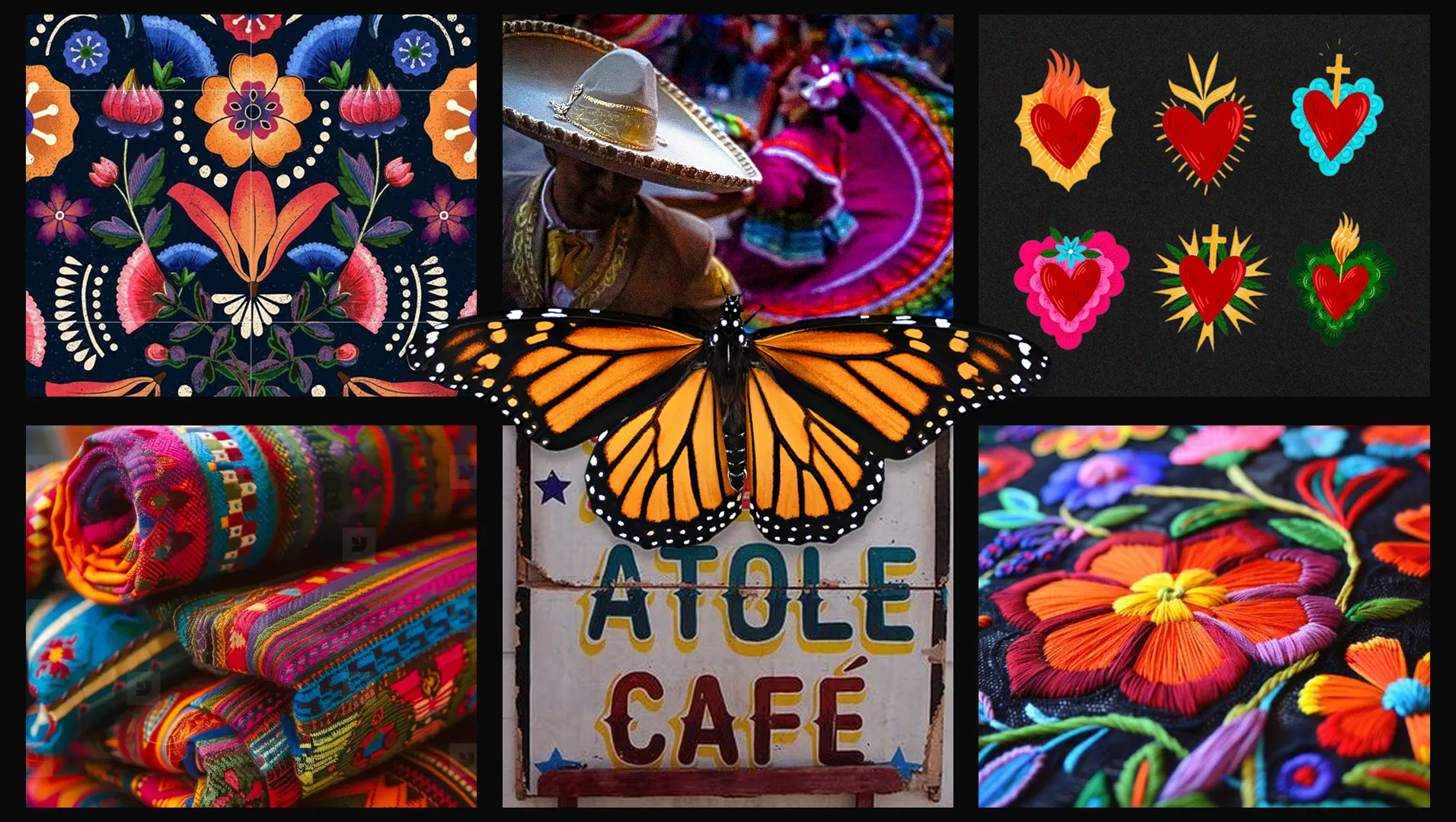
Moodboard grounded in street aesthetics, folk symmetry, and cultural motifs.

I incorporated colors of the client’s brand palette — including yellow, green, blue, and orange — in response to their request to include some of their elements if possible. I then expanded the palette with red and pink to enhance vibrancy and create a more balanced and visually striking color system.

The chosen typography blends a hand-drawn logo inspired by the "Marones" font — which evokes the look of traditional Mexican street signage — for a crafted aesthetic, "Ok Noted" to enhance the handmade feel for the highlights, and "Archivo" — one of the client’s branding font — that ensures consistency and clear readability in the body copy.
The butterfly serves as the main visual anchor, while sacred hearts — a timeless emblem of Mexican culture — are subtly integrated throughout the composition. These handcrafted elements build a cohesive visual identity that feels authentic, distinctive, and far from cliché.
The design draws inspiration from the monarch butterfly’s wing pattern, where each section fits together like a jigsaw puzzle.


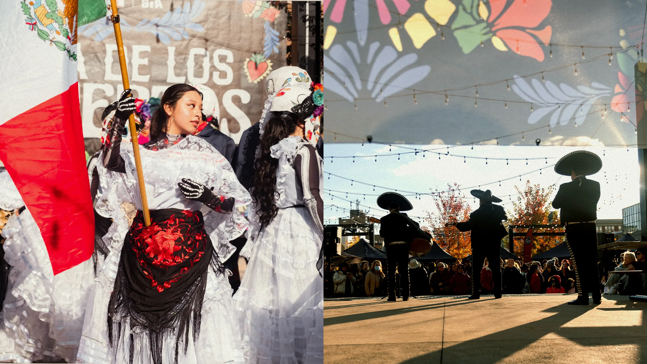
Here’s a peek at how the visual identity came to life — from signage to
atmosphere — capturing the energy, color, and spirit of the experience.