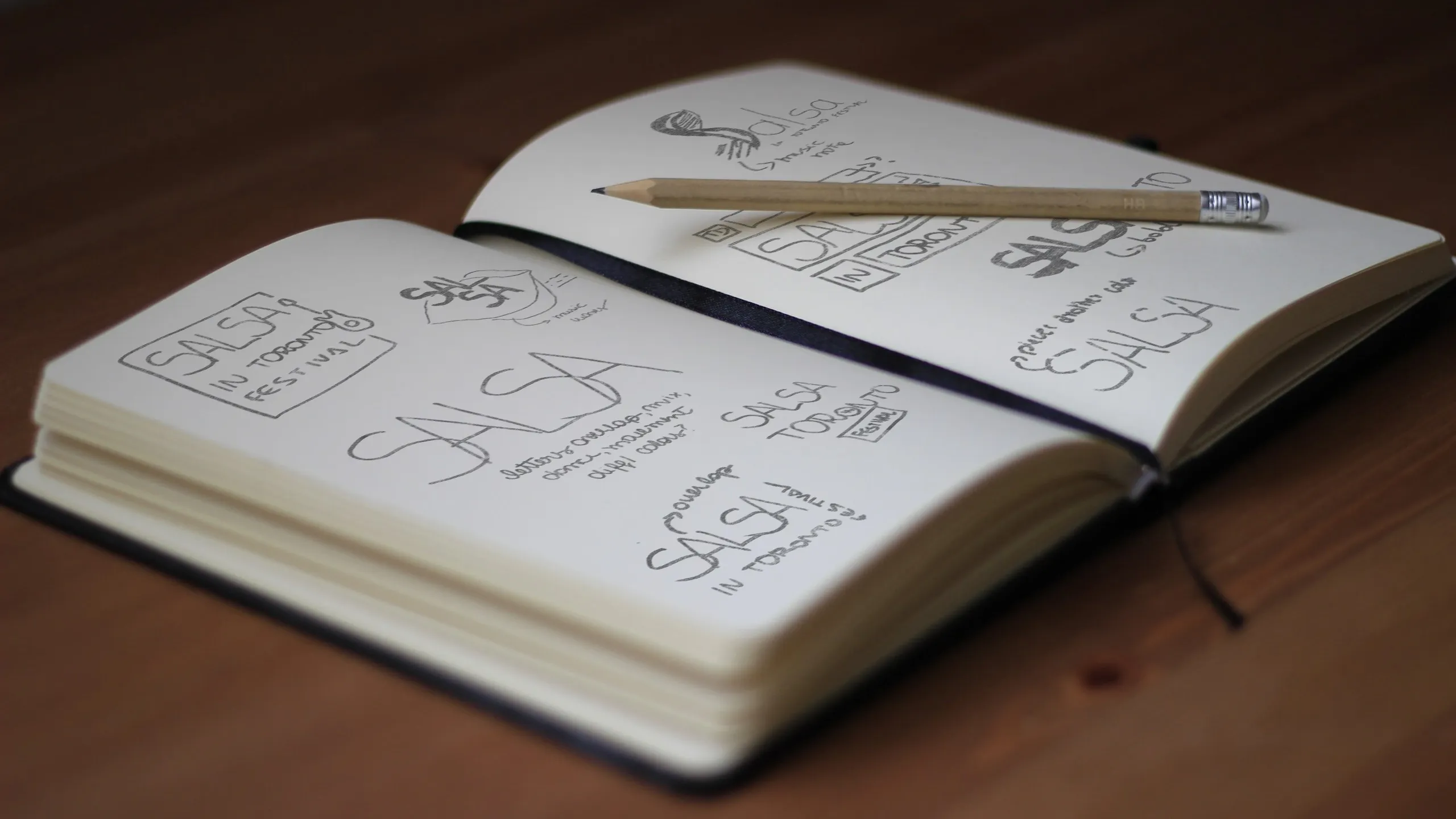
As lead designer 2023 and 2024, I overhauled the visual identity of Salsa in Toronto, one of Canada’s largest Latin festivals. The project culminated in the festival’s 20th anniversary in 2024. I introduced a new logo in 2023, which laid the foundation for the evolved 2024 branding—a scalable system that unified a growing portfolio of sub-events under one cohesive identity while preserving the unique character of each.
The brand was visually redundant and structurally unclear. The Salsa in Toronto
and Salsa on St. Clair logos were often displayed side by side, despite being
nearly identical — creating confusion around the brand hierarchy. Marketing
graphics were cluttered, overloaded with information, and lacked clear visual
hierarchy, making messaging hard to follow and weakening overall brand impact.
These issues led to a disjointed presentation that failed to clearly express the
brand’s identity, values, or scalability.

To unify a fast-growing festival and its expanding network of sub-events, I
reimagined the brand from the ground up — not just visually, but structurally.
The new identity system was designed for scalability, with a clear logic for
sub-brand differentiation that preserved a unified look and feel. The
overlapping logo forms reflect both the rhythm of Latin dance and the
multicultural intersections of Toronto, while the bold color palette and
typography were engineered for high visibility and consistency across
touchpoints — from street banners to mobile apps and national TV.
This wasn’t just a visual refresh — it was a strategic foundation for faster
execution, stronger brand recognition, and clearer communication with partners
and the public.

A vibrant moodboard inspired by tropicalism—blending bold colors and natural elements to evoke the lively, warm energy of South American culture.

A palette designed to reinforce the festival’s values within the community.
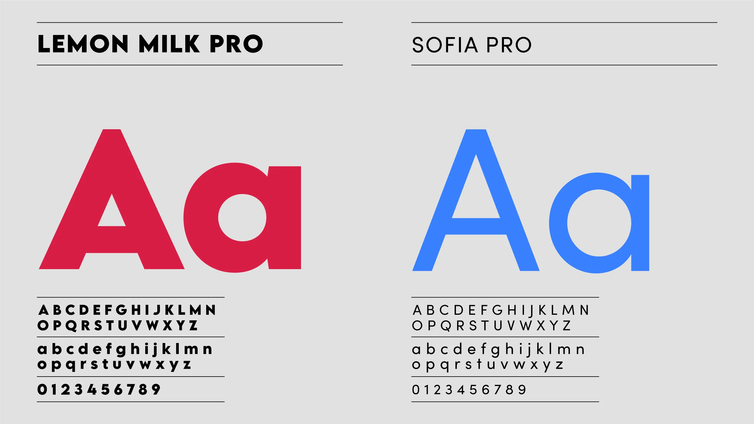
Bold sans-serif typography brings a modern, clean look with strong readability across all formats.
The logo captures Toronto’s multicultural energy—overlapping forms reflect movement, connection, and the vibrant spirit of the Latin community.
The logo captures Toronto’s multicultural energy—overlapping forms reflect movement, connection, and the vibrant spirit of the Latin community.
1. Enabled Faster Production at Scale - Created a streamlined
file structure and living brand guide to empower internal
teams and external vendors. This significantly reduced turnaround time,
eliminated design inconsistencies, and minimized redundant effort.

More than a brand guide, this framework was built to support the entire company — covering essentials like padding and layout to ensure consistency across all event materials.

In 2024, Salsa Festival expanded to Tremblant with a new color palette and the iconic tower, blending local charm with the festival’s signature branding.

Salsa Ambassador project - we maintained the same shape of the original Salsa logo but added warm, vibrant gradients and a supporting font for the ‘Ambassador’ text.
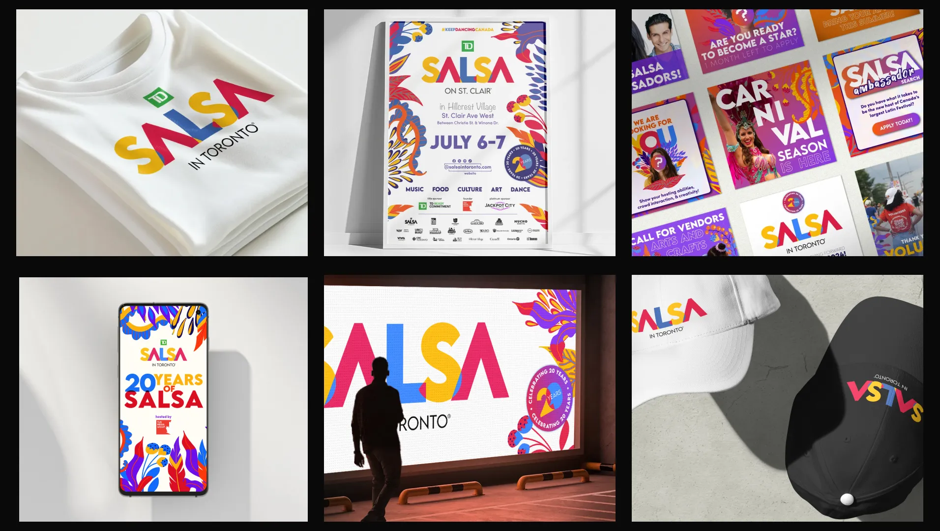
Different applications across different media.
After underwhelming results in the previous year, In 2024 I took creative direction over
the photography to ensure stronger alignment with the brand narrative. I
developed a detailed visual brief with clear do’s and don’ts to guide the
photographers — emphasizing cultural vibrancy, energy, and authentic moments of
connection.
The final images not only captured the essence of Latin culture but also
elevated the overall brand perception across digital, broadcast, and
sponsor-facing platforms.


